Leading up to the holidays in 2025, we're happy to share a series of content modeling pitfalls and guidance from Dmitry Bastron. Check out the other parts for all the tips from this experienced Kentico practitioner.
Day 2: The "Cartiglio Component
❌ The mistake
Creating a single, manually filled "summary component" just because the design needed a neat white box — and then forcing that same box onto every page type under the sun.
Ours was the legendary "Cartiglio", a key–value panel intended to summarize anything the site threw at it. It became such a recurring pain point that it turned into an internal meme.
And yes — the slightly exotic component name gives away its origin. Let’s just say: when components arrive with names you have to translate first, there’s usually a deeper story behind them.
⚠️ What problems this creates
Editors are forced to retype the same information across dozens or hundreds of pages.
Content gets out of sync — one page is updated, its "cartiglio clones" are not.
Domain logic gets lost: products, categories, case studies all pretend to follow the same rules.
Imports, automations, and integrations become nearly impossible.
Eventually everyone forgets what belongs there — but the design requires it, so… 🤷♂️
🤦♂️ Why teams make this mistake
It’s one of the easiest traps when you split implementation purely by design, not by content meaning. If two things look the same, it’s tempting to assume they are the same:
- "It’s just a few fields."
- "It’s only a key–value summary."
- "We’ll make it flexible so it works everywhere."
Except — and this is where it gets painful — what looks like a duck does not always quack like a duck. Design similarity ≠ domain similarity.
💸 How much it costs to fix
On one recent project, the Cartiglio was used across hero banners for product categories and case studies. Everything was manually duplicated:
- Product category info that should’ve come from PIM instead
- Case study metadata that should’ve been stored as structured fields and reused
- The dev effort was moderate (~40 hours) to fix it.
But how about content rework? ~100 case studies × 8 languages = 800 pages needing manual cleanup and repopulation. That’s where the true cost lies. As for Product categories, we were lucky to just re-import them from PIM 😌
📘 Best practice
Kentico’s content modeling guidance is pretty explicit about this: split your components and content by meaning, not by design coincidence.
💬 Got your own "cartiglio" story? Drop it in the comments — every team has that one component that tried to be everything.
Day 3: The "Automatic Navigation" Illusion
❌ The mistake
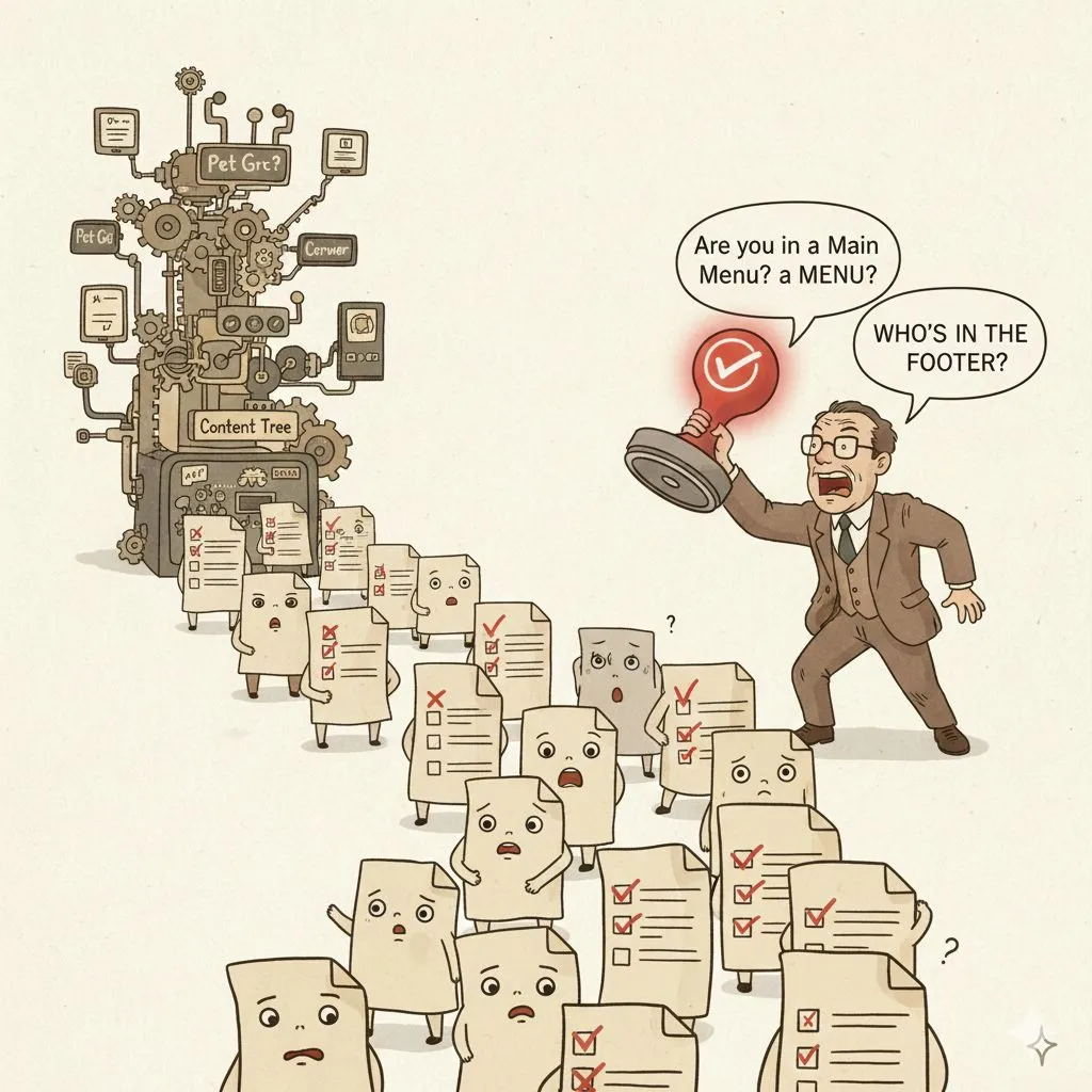
Relying on a magical little checkbox – "Include in navigation" – to build your entire website’s menu. Every page type gets the setting, editors tick it and hope for the best. It feels automatic… until you have a few hundred pages and that checkbox starts to own you.
⚠️ What problems this creates
You can’t insert anything that isn’t a page. External links? Calls to action? Extra cards? Forget it. Sort order becomes a nightmare – editors end up dragging pages around the content tree just to nudge a menu item up or down.
Mobile vs desktop navigation?
That means another checkbox, another headache and more edge cases. You can’t change the label or add an icon without hacking the underlying page type.
🤦♂️ Why teams make this mistake
Old habits die hard. Kentico’s Portal Engine (and many other DXPs back in the day) had a built-in menu builder that sniffed the content tree.
It was simple, and for a 20-page site it works. When those same teams graduate to a 500-page multilingual site, they cling to the checkbox because it feels safer than defining a real navigation model.
It’s also tempting when a project manager says, "We need the site live next week."
💸 How much it costs to fix
On one of this year’s audit projects, reviewing the "automatic" navigation highlighted major performance issues. The team had added so many exceptions, custom rules, and sorting tweaks that rendering the header + footer consumed 80% of all page load time.
Fixing the model took around 20 developer hours — quick enough.
But editors had to rebuild the entire navigation manually. At first, they weren’t thrilled, but once they gained full control (external links, proper ordering, different mobile structure, custom captions), they never wanted to go back.
📘 Best practice
Navigation should be modeled as its own content, not a magical byproduct of pages.
Kentico’s docs outline this clearly:
💬 Ever worked with "automatic navigation" that turned anything but automatic? Share your story — we’ve all seen some creative interpretations.
Day 4: The "Everything Must Be Commerce!" Mirage
❌ The mistake
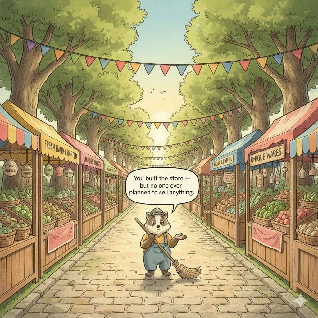
Hearing the word "products" and instantly assuming the client needs a full-blown B2C e-commerce catalog — SKU logic, variants, discounts, bundles, transactional workflows — even when they’re not selling online at all.
But many businesses, especially in B2B, don’t need commerce. They need a flexible product presentation model, not a storefront.
⚠️ What problems this creates
- Product structures get forced into rigid SKU-based assumptions they never needed. Teams spend weeks customizing e-commerce features that provide zero business value.
- Complex B2B product hierarchies become impossible to represent cleanly.
- Editors wrestle with irrelevant fields: pricing, discounts, inventory.
- Market-specific differences become unmanageable.
- Eventually the whole model becomes harder to maintain than the products it was meant to showcase.
🤦♂️ Why teams make this mistake
Because when someone says "products," the natural reflex is:
- "Great, sounds like commerce — let’s enable the catalog!"
- It feels safe and familiar, especially with platforms that offer ready-to-use B2C structures.
But B2B reality is very different:
- Many businesses don’t even sell online.
- What is a "product" in one market may be a variant or subcategory in another.
- A "bundle" might mean a configurable system, not something packaged for purchase.
- SKUs may be internal, inconsistent, or not customer-facing at all.
- What these organizations actually need is a flexible content model that can express products, variants, configurations, and market-specific structures — not a commerce engine.
- When teams start with the wrong assumptions, they end up fighting the system instead of designing what the business truly needs.
💸 How much it costs to fix
Over the last several years, we’ve had multiple clients approach us asking to "optimize the commerce build."
After a few conversations it became obvious: there was no commerce. No transactions. No baskets. No direct sales. Just a business trying to present a complex catalog in a structured, meaningful way.
We scrapped the SKU-driven monsters, collected real requirements, and built a proper product model that reflected how the business actually works.
Fixing these wrong turns often takes weeks or even months — not because the modeling is hard, but because the incorrect assumptions had spread everywhere.
📘 Best practice
Kentico’s content modeling guidance is very clear:
- Build the product model that matches your business — not the one a B2C store assumes.
- Model the product catalog
💬 Have you ever witnessed a "commerce build" forced onto a business that didn’t need commerce at all?
Day 5: The "Death Star Component"
❌ The mistake
Trying to pack every visual variation of a component into one gigantic, all-powerful mega-widget.
A hero that can be an image, or a carousel, or a video, with configurable typography, five optional text positions, a dozen toggles, and an entire drawer of conditional logic.
It looks flexible… until you try using it.
⚠️ What problems this creates
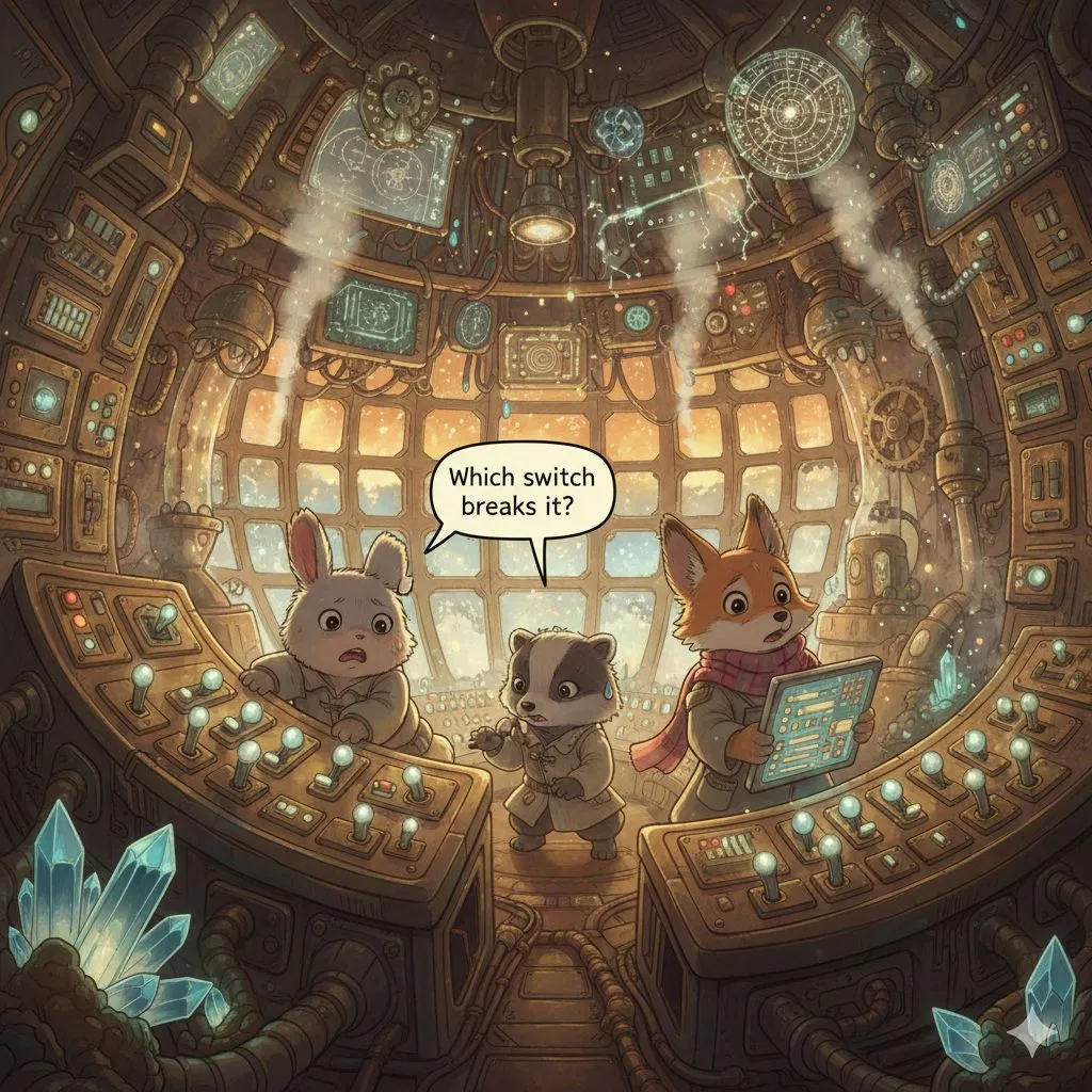
Content forms become wall-to-wall switches no editor can understand.
Supporting one variation breaks another — because everything is secretly interconnected.
QA becomes a probability exercise ("Which of the 4,000 combinations did we test?")
Editors constantly ping the team with "How do I make this layout again?"
🤦♂️ Why teams make this mistake
It starts innocently:
You build a hero variation. Then another. Then a third.
Each needs "just one more field," or "just add a toggle," or "let’s make it optional…"
Before you know it, you’ve built a Death Star component — massive, complicated, and covered in blinking buttons no one dares to touch.
It seems powerful, but one misplaced toggle and the whole thing explodes.
💸 How much it costs to fix
On a recent project, we inherited a hero component that tried to do everything: images, carousels, video, five text layouts, optional CTAs, and custom typography — all hidden behind a labyrinth of switches.
The client had 10+ open bugs, and fixing one issue often broke other variations we were unaware of.
We split this monster into four clearly named components, each doing one job well.
Developer effort wasn’t huge (thanks to reusable field schemas), but all content had to be repopulated.
Still, the sigh of relief from editors was worth it.
📘 Best practice
Kentico’s content modeling guides strongly discourage building "one component to rule them all":
- Design website content – why components with too many settings harm usability
- Refactor content model with reusable schemas
💬 Have you ever encountered a "Death Star component"?
Share your battle stories — bonus points if it had a self-destruct toggle.
Day 6: The "Tree-Only Thinking" Trap
❌ The mistake
Treating the content tree hierarchy as the answer to every relationship: "If this content belongs under that section, let’s just put it in the tree and inherit it from the ancestors."
Before long, the tree becomes taxonomy, configuration, metadata… even feature toggles.
⚠️ What problems this creates
- Content that should be centralized ends up scattered across subtrees.
- Editors can’t easily see what applies where — the logic is buried in the hierarchy.
- Queries become slow and complicated ("walk all ancestors and hope something is there…").
- It becomes impossible to model multi-dimensional relationships (market, audience, category, etc.).
🤦♂️ Why teams make this mistake
Because "inherit from parents" feels intuitive.
It mirrors how navigation works, so teams assume it applies to everything: banners, notifications, sub-navigation, promos, you name it.
Also, requirements often include lines like:
- "This should appear on all pages under this section."
And without thinking, teams model this as:
- "Okay, let’s put the config on that section."
But often — not always, but often — that configuration should be a global piece of content with rules attached, not a property buried in the tree.
💸 How much it costs to fix
On a recent project, the site had "notification panels" (the classic COVID-style alerts) defined high up in the tree — and every page had to traverse ancestor pages to figure out which ones to display.
Funny enough, the actual fix was tiny — less than a day of dev time.
But discovering that this innocent-looking pattern was responsible for a major performance bottleneck? That took considerably more time… and a noticeable amount of emotional resilience from the team. 😵💫
Dozens of queries per request, multiplied across a large site, hid inside a logic flow no one suspected.
Once we traced it back to "walk all ancestors to find the notification," the refactor to a global model was trivial.
But the detective work leading up to it? Let’s just say the developers earned their victory coffee.
📘 Best practice
Kentico’s content modeling guides strongly encourage separating hierarchical structure, taxonomy, and global content instead of overloading the tree with responsibilities it shouldn’t carry:
- Understanding what belongs in the tree vs. what doesn’t
- Model taxonomies – how to use classification instead of tree-based hacks
💬 Have you ever inherited a site where the tree tried to do too much?


